|
Hello everyone! For the past few weeks I have been practicing and learning typography in my technology class. Typography means the visual component of a written word. I learned that based on what kind of fonts you use, the people looking it at it might interpret a different way. There is even a quote that says, "Each font has a personality and a purpose". I think this quote means that each font has a place to be and they have different places to be because of their styles. There are mainly 5 types of ways we can group the different types of fonts into. Serif, Sans Serif, Monospace, Display, and Script. Serif is the fonts that have "feets" and mainly used for news papers. They look simple yet sophisticated. Sans Serif is the opposite of Serif. It doesn't have "feets" and are mostly used online because of their simple look. Monospace is types of fonts that have letters that all have the same amount of space. They are mostly used in online too because of their simple and organized look. Displays are the fancy and extra fonts. They are used in adds to catch one's attention. Lastly script is used when you want to make your work fancy because of it's fancy and old look. Here are some of the assignments I have been working on. One is with the font with the same sentence. The other assignments are many examples of fonts that can be used in the correct way and the wrong way. I hope you guys find this information helpful! Typeface ComparisonThis assignment is here to show that different fonts can change the feels of a text. You can see below that all of these texts have a different style. This clearly shows that fonts can affect how you see a design. 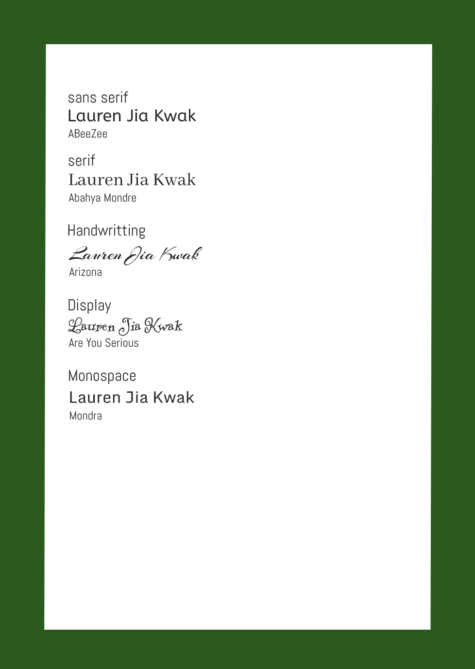 Word PortraitsThis shows how fonts can affect writing and show how weird they can look if used in a wrong way. 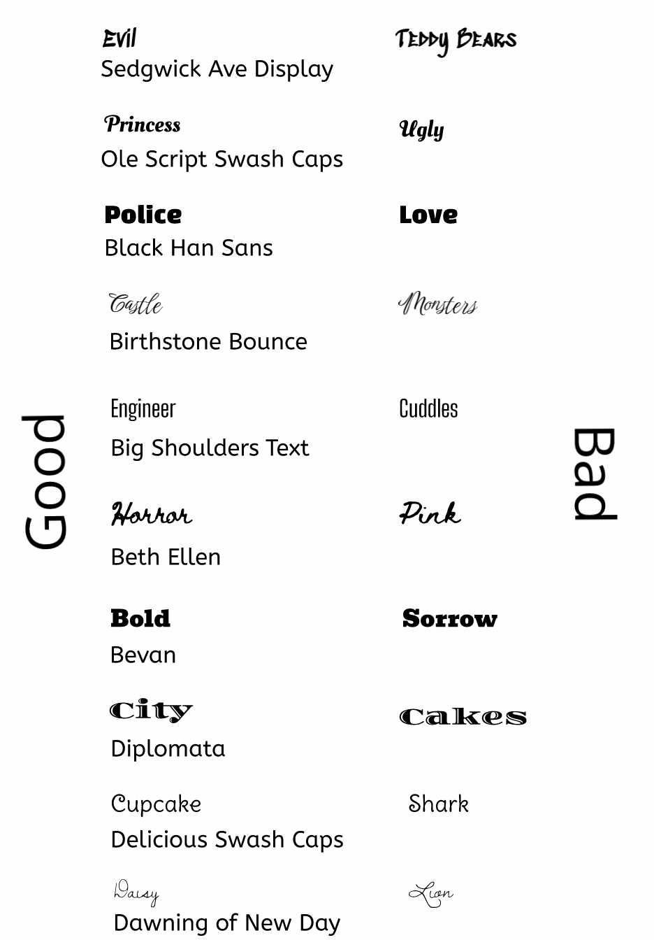
0 Comments
|
