|
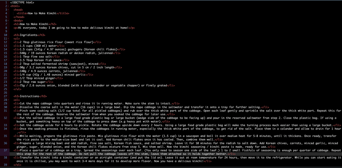
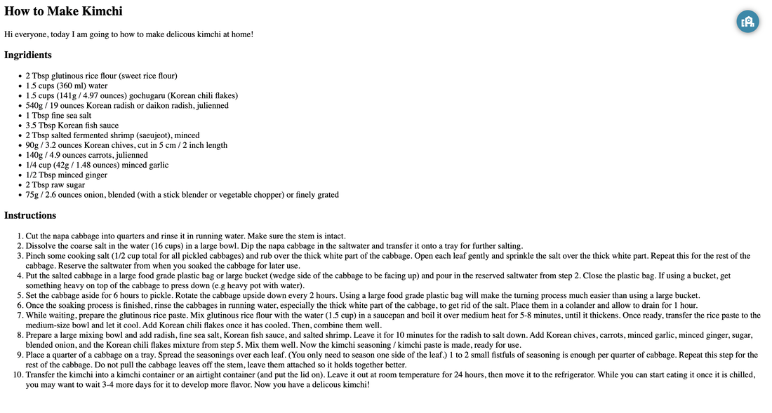
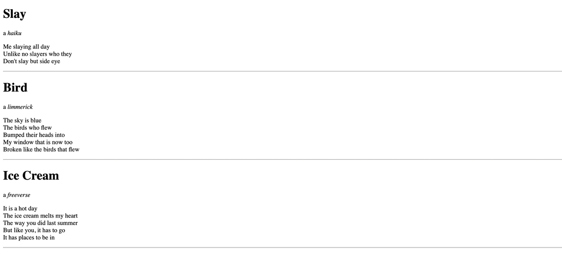
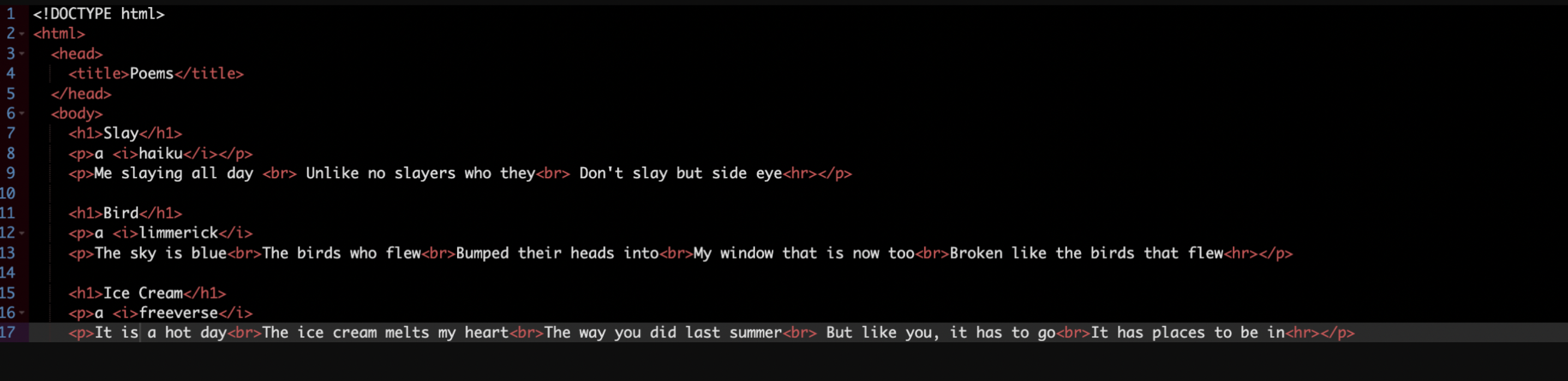
Hello everyone! Today I learned how to make a website through neocities! I have to use codes in order to write or do something. Use this link to see!   Hello! Today I am here to show you how I did my logo summative. I had to create 3 logos and 3 variations as shown below. While making this logo it was challenging to make each variation unique and special. But I still like exploring Corel Vector and learning about new things while I was doing the assignment. I feel like I learned how to be original and creative through the logo process because I had to be creative for each design. I hope you enjoy my logos! 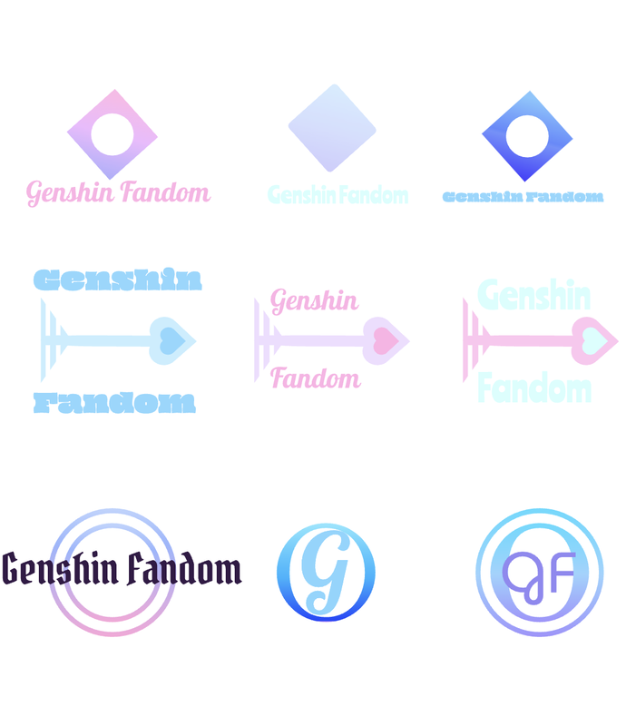 I came up with this brand for the game I liked. This brand is a fandom and is supposed to be something like a fan cafe. The logos are pretty much simple. It is the image of the game and the initial of the brand. The logo I chose below was my favorite. I chose this as my favorite because I thought it was original and cute. The arrows represent the game and my interest because my favorite character in the game is a bow character. I hope you have a nice day byee!! 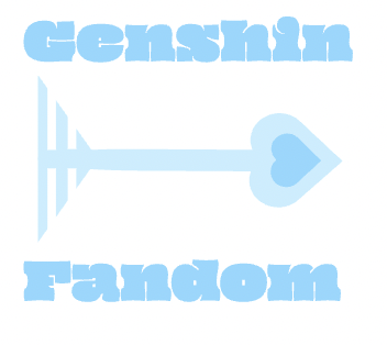 For this assignment I wanted to make a unique logo for a game fandom. Out of these 15 logos I chose 1, 6, and 8. The G for the first design represents the name of the game, Genshin. The second logo represents an arrow. One of the gods in the game uses an arrow so I used to represent it. Lastly the last design represents primogems. Primogems are a type of currency that is used in Genshin. I like all of the designs but number 12 and 15. I don't like them because they look too messy. The process went great because I like drawing and creating stuff. The most difficult part was designing and the easiest. I hope I can do more of these kinds of projects! 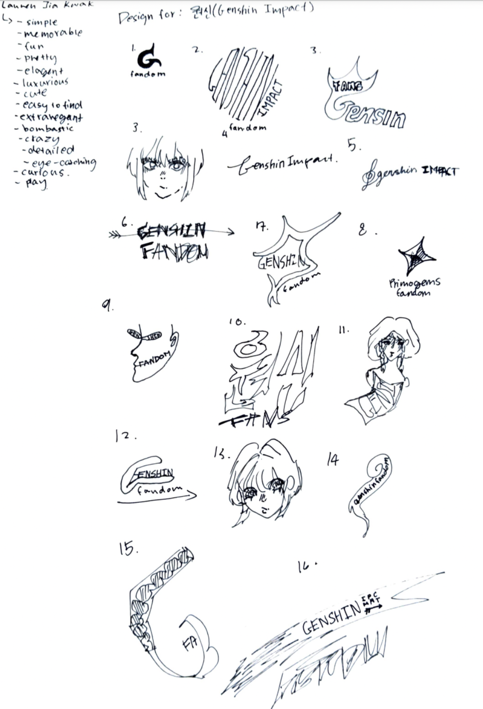 Hello Everyone! This is my Color Theory Summative. I created these two art work for the last two classes. They are called, "Color Names", and, "Color Schemes". I created Color Names by selecting a variety of colors and named them with both hex codes and RGB codes. Some challenges I faced while creating this was finding how to find the hex codes and RGB codes because I didn't know where they were. I later found out that they were on the bottom of the color changing pallet. I got inspired from "인생네컷" and so followed the design to match my work. I am satisfied and proud of my work since it came out so nicely. The other one, "Color Schemes", I used Adobe to make the color schemes. It was fun to learn how to generate different types of color schemes. The color schemes I used for my project is Triad, Complementary, Analogous, and Monochromatic. I am proud of this art work to because I like the way I can see the different color schemes. Hoped this helped, bye! Color Names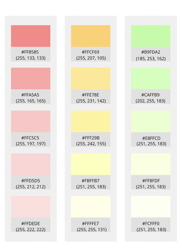 Color Schemes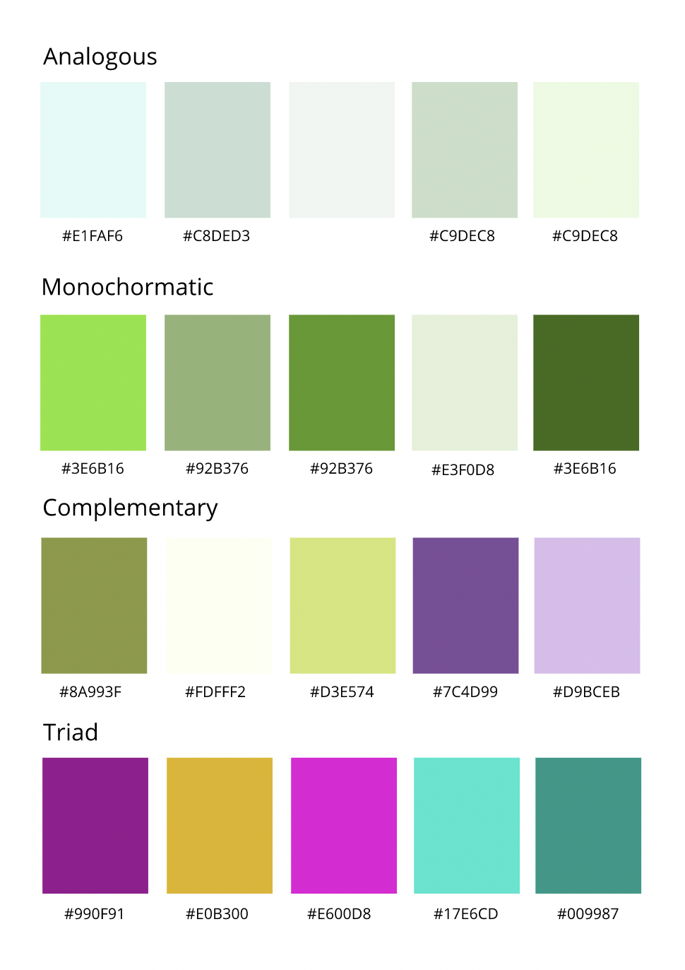 Hello everyone! For the past few weeks I have been practicing and learning typography in my technology class. Typography means the visual component of a written word. I learned that based on what kind of fonts you use, the people looking it at it might interpret a different way. There is even a quote that says, "Each font has a personality and a purpose". I think this quote means that each font has a place to be and they have different places to be because of their styles. There are mainly 5 types of ways we can group the different types of fonts into. Serif, Sans Serif, Monospace, Display, and Script. Serif is the fonts that have "feets" and mainly used for news papers. They look simple yet sophisticated. Sans Serif is the opposite of Serif. It doesn't have "feets" and are mostly used online because of their simple look. Monospace is types of fonts that have letters that all have the same amount of space. They are mostly used in online too because of their simple and organized look. Displays are the fancy and extra fonts. They are used in adds to catch one's attention. Lastly script is used when you want to make your work fancy because of it's fancy and old look. Here are some of the assignments I have been working on. One is with the font with the same sentence. The other assignments are many examples of fonts that can be used in the correct way and the wrong way. I hope you guys find this information helpful! Typeface ComparisonThis assignment is here to show that different fonts can change the feels of a text. You can see below that all of these texts have a different style. This clearly shows that fonts can affect how you see a design. 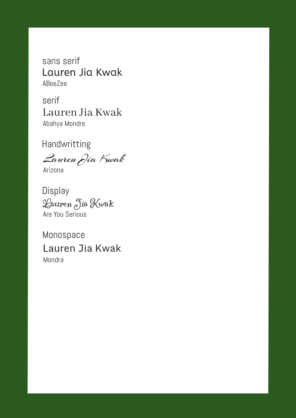 Word PortraitsThis shows how fonts can affect writing and show how weird they can look if used in a wrong way. 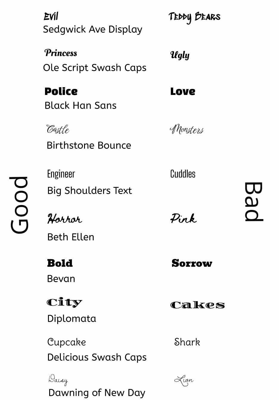 cHi I am Jia! Today I made a cute koala by using codes to draw. I learned how to draw with codes with Khan Academy Java Script Tutorial! Besides from learning how to draw with codes, I learned how coding is related to computer science and program. These types of things use codes to communicate with computers so that humans can be able to get datas from them. Coding is the translation of language of the computers that we can write in. I think I will be able to use my coding skills in daily life by drawing digital art or creating simple functions. 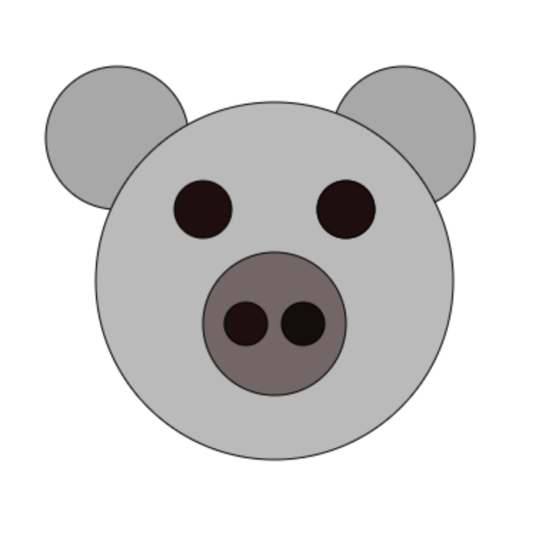 fill(168, 168, 168);
ellipse(90, 100, 100, 100); ellipse(290, 100, 100, 100); fill(186, 186, 186); ellipse(200, 200, 250, 250); fill(117, 102, 102); ellipse(200, 230, 100, 100); fill(20, 13, 13); ellipse(220, 230, 30, 30); fill(33, 13, 13); ellipse(180, 230, 30, 30); ellipse(150, 150, 40, 40); ellipse(250, 150, 40, 40); ellipse(250, 150, 40, 40); |